As per my book cover theme lately, I thought I'd do something...fun.
I've noticed an annoying trend in YA book covers.
Thing is, a lot of YA book covers look like more professional versions of the "selfie" made infamous by Facebook. A girl (it's almost always a girl) looks coyly over her shoulder, staring deeply into the camera...sometimes even with a duckface. It might be more Angelina Jolie than ridiculous, but it's still a duckface. See Exhibit A, slight pouty duckface, perfectly curled hair, flirty look, and all:
This is the kind of photo I might post to Facebook to say, "Look how subtle and intriguing I am! You're attracted by my sexy air of mild danger (but not too dangerous, because that would be unfeminine and scare you away)." Kind of bland. Would you guess that that character is supposed to be an assassin? No? How about this cover, for the same book?
Other selfies take a bolder look, though the model is still angled intriguingly away from the camera.
This is the kind of picture I would post to Facebook if I had long, flowing hair. I'd stand in a windy place and make sure it fell over one half of my face, to say, "Look how deep and mysterious I am."
Oh, and I should probably mention that Elisa, the main character of The Girl of Fire and Thorns, is described as overweight and dark-skinned. She barely fits into her wedding dress, resorts to comfort-eating when anxious, and is not white by any stretch of the imagination. She lives in jealousy of her lighter-skinned, slimmer, taller sister. But sexy-looking white girls are all the rage on book covers, so oh well, I guess. Here's the UK cover, which is truer to the book:
[EDIT: A commenter pointed out that the girl-under-a-moon cover was concept art, and was rejected for the same reasons I pointed out. The reason I included it was because it came up when I searched the book -- along with the current cover -- and made me think, "Huh?" While it's troubling that the "white girl in flowing dress" was the automatic go-to for this book -- it's troubling that that cover was ever considered at all -- it's encouraging that someone saw it and put their foot down.]
Still other selfies take up the entire cover with their face. I'm sure the character is important and all, but the awkward truth is that I read on the toilet, and I don't want someone's face on my lap.
I would comment on this pic to compliment her on her new colored contact lenses.
This version of Delirium wins Most Annoying Cover, as it will stare at me on the toilet while making a duckface.

Here, we see the Selfie in a Seductive Position:

The Fury trilogy is one of my favorite series. I had the UK version of Fury, which is gorgeous, and was absolutely furious (ha, ha) when the US versions came out with yet more boring covers of creepily sexualized teenage girls in selfie poses. My version of Fury looks like this:

...which is absolutely gorgeous, but more importantly, gives you a hint that the girl on the cover is actually a supernatural creature like...gee, I don't know...a Fury. Hence her Greek-esque dress and flowing flame hair. I would call this a selfie done right because it's not just an objectifying photo of a sexy girl. The effect with her hair is intriguing, out of the ordinary, and recalls flames. It's artistic. Coupled with a title like Fury, it gives me a decent impression of what the book is about. I was really looking forward to having this copy of Envy, which shows another Fury who wears her signature red ribbon around her neck:

Instead I have the generic copy pictured before, which also doesn't match my copy of Fury. Le sigh.
When the selfie is done right, it shows us something about the book. It's more than just another tired attempt at sex appeal. Sex appeal which gets creepier the longer you think about it, since the characters portrayed are meant to be underage teens. For example, the cover for Mila 2.0 is a good version of the selfie:

Yes, it's a pretty girl looking at you. But she's looking face-on, not coyly and invitingly over one shoulder. The most striking thing is the pixelation of her face and shoulder. If I had to critique the art, I'd say the stream coming off her shoulder is distracting and not as effective as the one on her face. The most important thing, though, is that this cover tells us Mila is an android.
The different Paper Towns selfies were clever as well. One showed the Margo that everyone sees, and the other showed the Margo that Margo hides.
Oddly enough, Margo isn't the main character. The main character is a boy, Q. But girls on YA covers sell better or something, I guess.
I object to these covers because they aren't designed to show something relevant about the plot, character, or world of the book. They're about making the book look sexy -- which almost always means sexualizing teenage girls. Apparently that's what people are attracted to in a book. "If you read this book, you will be as glamorous as the cover model." "All teens want is to look attractive and sexy, so that's what they must be looking for in books. Cue the sex appeal."
I am not the kind of person whose body or face is typically depicted on these covers. I'm not glamorous. I can't relate to that. I'm white, though. Notice how all these covers have the same phenotype: white, very pale, young, and slim? Even when the character is NOT white, somehow a white model ends up on the cover. Refer to Fragments and Girl of Fire and Thorns.
I will say one thing for the Twilight books: they did their covers right. The images always had the color scheme of black, white, and red, symbolizing night, day, and blood. They looked artistic and were intriguing enough to warrant a second glance. The image of the apple -- the supposed forbidden fruit -- was also relevant to the story. Bella offers her love to Edward; she holds out the forbidden fruit on the cover. It required a lot more thought and effort to create than slapping the photo of a model on the cover and calling it a day because sex appeal wins all the time.
I pick up books because I want to read books. The thing inside the book -- that thing called the story which is made up of smaller things called words -- is what interests me. I expect a cover to entice me by showing a hint about the story. Not only are the selfie covers annoying on principle, they also leave me no room to imagine what the main character looks like. They show me the character, but not their world. When I walk down a row of shelves and see that kind of cover, the effect is the same as passing a random stranger on the street. I don't care. All I see is a face like any other.
To get my attention, a book has to get through several barriers. One: the title barrier. If the title sounds corny, I will roll my eyes and ignore. Two: the cover. If the cover is a generic selfie, there is very little chance that I will pick it up to read the back or the flap, even if I liked the title.
Before I Fall got my attention on the title, but I was dubious about the cover:

It's a sentimental, sweet image, and I wasn't looking for a sentimental, sweet book at the time. Pastel green, pink, and white; an image of springtime and nature; the peaceful look on the model's face...I'd post this selfie on Facebook to say, "I'm a shy and sensitive nature girl."
I ended up reading the book anyway...and felt completely misled by the cover. It's a fantastic book. It's also really grim. This girl has to relive the last day of her life over and over again, trying to stop the suicide of the social pariah she bullied since middle school. Sure there's a romance. Sure there are sweet moments. But if I had picked up this book expecting the sentimental summer read this cover implies, I would be shocked out of my mind. Not only does it have nothing whatsoever to do with the book, it even betrays the mood and tone.
I much prefer the alternate, fan-designed cover. I can't find the image, but the cover was created for a contest Lauren Oliver herself started. She said she got an email from a guy friend: "Can you please put less girly covers on your books so I can read them?" That email sparked a cover contest. Books with "girly" covers were made more generic, while books with "masculine" covers were given a feminine touch. Before I Fall reworked had a stark black-on-white theme, with the title in white letters over a black splatter of what might have been blood. More eye-grabbing, less generic, and true to the tone of the book.
OH WAIT! I almost forgot the boob shot:
and the male version...
The point of all this is to say that I wish cover art was more about the art and more about the book. If I want to peruse the art of the selfie or contemplate duckfaces, I'll go on Facebook.
Agree? Disagree? Leave me a comment!
I've noticed an annoying trend in YA book covers.
Thing is, a lot of YA book covers look like more professional versions of the "selfie" made infamous by Facebook. A girl (it's almost always a girl) looks coyly over her shoulder, staring deeply into the camera...sometimes even with a duckface. It might be more Angelina Jolie than ridiculous, but it's still a duckface. See Exhibit A, slight pouty duckface, perfectly curled hair, flirty look, and all:
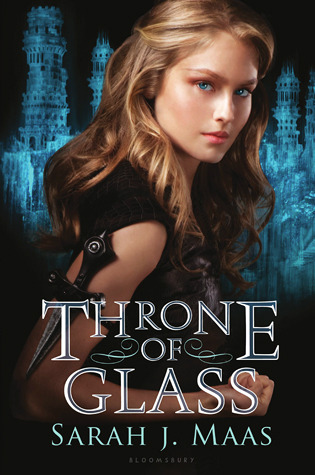 | ||||||
| How does that dagger (if you even notice it under the title text) stay on her arm without cutting her anyway? |
 |
| Now THAT'S more like it. |
 |
| Look, it's a girl standing under a moon. |
Oh, and I should probably mention that Elisa, the main character of The Girl of Fire and Thorns, is described as overweight and dark-skinned. She barely fits into her wedding dress, resorts to comfort-eating when anxious, and is not white by any stretch of the imagination. She lives in jealousy of her lighter-skinned, slimmer, taller sister. But sexy-looking white girls are all the rage on book covers, so oh well, I guess. Here's the UK cover, which is truer to the book:
 |
| See how it tells us about the setting and the world of the novel? Deserts and NOT European-based white-girl fantasy? |
Still other selfies take up the entire cover with their face. I'm sure the character is important and all, but the awkward truth is that I read on the toilet, and I don't want someone's face on my lap.
 |
| The orchids are a nice touch, but when it comes down to it, this tells me nothing about the book. |
This version of Delirium wins Most Annoying Cover, as it will stare at me on the toilet while making a duckface.
Here, we see the Selfie in a Seductive Position:
The Fury trilogy is one of my favorite series. I had the UK version of Fury, which is gorgeous, and was absolutely furious (ha, ha) when the US versions came out with yet more boring covers of creepily sexualized teenage girls in selfie poses. My version of Fury looks like this:
...which is absolutely gorgeous, but more importantly, gives you a hint that the girl on the cover is actually a supernatural creature like...gee, I don't know...a Fury. Hence her Greek-esque dress and flowing flame hair. I would call this a selfie done right because it's not just an objectifying photo of a sexy girl. The effect with her hair is intriguing, out of the ordinary, and recalls flames. It's artistic. Coupled with a title like Fury, it gives me a decent impression of what the book is about. I was really looking forward to having this copy of Envy, which shows another Fury who wears her signature red ribbon around her neck:
Instead I have the generic copy pictured before, which also doesn't match my copy of Fury. Le sigh.
When the selfie is done right, it shows us something about the book. It's more than just another tired attempt at sex appeal. Sex appeal which gets creepier the longer you think about it, since the characters portrayed are meant to be underage teens. For example, the cover for Mila 2.0 is a good version of the selfie:
Yes, it's a pretty girl looking at you. But she's looking face-on, not coyly and invitingly over one shoulder. The most striking thing is the pixelation of her face and shoulder. If I had to critique the art, I'd say the stream coming off her shoulder is distracting and not as effective as the one on her face. The most important thing, though, is that this cover tells us Mila is an android.
The different Paper Towns selfies were clever as well. One showed the Margo that everyone sees, and the other showed the Margo that Margo hides.
| The left one would be my profile picture. If I was having a bad day, I'd post the right one with a sad song lyric and wait for someone to comment. |
I object to these covers because they aren't designed to show something relevant about the plot, character, or world of the book. They're about making the book look sexy -- which almost always means sexualizing teenage girls. Apparently that's what people are attracted to in a book. "If you read this book, you will be as glamorous as the cover model." "All teens want is to look attractive and sexy, so that's what they must be looking for in books. Cue the sex appeal."
I am not the kind of person whose body or face is typically depicted on these covers. I'm not glamorous. I can't relate to that. I'm white, though. Notice how all these covers have the same phenotype: white, very pale, young, and slim? Even when the character is NOT white, somehow a white model ends up on the cover. Refer to Fragments and Girl of Fire and Thorns.
I will say one thing for the Twilight books: they did their covers right. The images always had the color scheme of black, white, and red, symbolizing night, day, and blood. They looked artistic and were intriguing enough to warrant a second glance. The image of the apple -- the supposed forbidden fruit -- was also relevant to the story. Bella offers her love to Edward; she holds out the forbidden fruit on the cover. It required a lot more thought and effort to create than slapping the photo of a model on the cover and calling it a day because sex appeal wins all the time.
I pick up books because I want to read books. The thing inside the book -- that thing called the story which is made up of smaller things called words -- is what interests me. I expect a cover to entice me by showing a hint about the story. Not only are the selfie covers annoying on principle, they also leave me no room to imagine what the main character looks like. They show me the character, but not their world. When I walk down a row of shelves and see that kind of cover, the effect is the same as passing a random stranger on the street. I don't care. All I see is a face like any other.
To get my attention, a book has to get through several barriers. One: the title barrier. If the title sounds corny, I will roll my eyes and ignore. Two: the cover. If the cover is a generic selfie, there is very little chance that I will pick it up to read the back or the flap, even if I liked the title.
Before I Fall got my attention on the title, but I was dubious about the cover:
It's a sentimental, sweet image, and I wasn't looking for a sentimental, sweet book at the time. Pastel green, pink, and white; an image of springtime and nature; the peaceful look on the model's face...I'd post this selfie on Facebook to say, "I'm a shy and sensitive nature girl."
I ended up reading the book anyway...and felt completely misled by the cover. It's a fantastic book. It's also really grim. This girl has to relive the last day of her life over and over again, trying to stop the suicide of the social pariah she bullied since middle school. Sure there's a romance. Sure there are sweet moments. But if I had picked up this book expecting the sentimental summer read this cover implies, I would be shocked out of my mind. Not only does it have nothing whatsoever to do with the book, it even betrays the mood and tone.
I much prefer the alternate, fan-designed cover. I can't find the image, but the cover was created for a contest Lauren Oliver herself started. She said she got an email from a guy friend: "Can you please put less girly covers on your books so I can read them?" That email sparked a cover contest. Books with "girly" covers were made more generic, while books with "masculine" covers were given a feminine touch. Before I Fall reworked had a stark black-on-white theme, with the title in white letters over a black splatter of what might have been blood. More eye-grabbing, less generic, and true to the tone of the book.
OH WAIT! I almost forgot the boob shot:
 |
| "Look at my new shirt!!! Isn't it CUTE? ;)))" |
 |
| "Check out my sweet new tats...I'm not even flexing." |
Agree? Disagree? Leave me a comment!
Haha, great post. Cover art should be more about the story. I often feel it's based more on marketing strategy (which is probably true). For City of Bones I actually like the Movie Tie-In Cover wayy better. With the influx of people on covers, I've started to prefer books without faces. And as for Girl of Fire & Thorns, I need to find a way to get me the UK cover. Sometimes other covers look so much better than the US version.
ReplyDeleteI felt like that with FURY and ENVY. I tried to special-order the UK version, but the bookstore I went to couldn't do it. And I'd rather patronize the local indie bookstore than find it on Amazon.
DeleteThe Throne of Glass cover is also the UK version. I wonder if this is a regional thing?
My only problem here is that the cover you have posted for the US girl of fire and thorns isn't the cover...that was early concept art that they got rid of during ARC distribution for precisely that reason. The new covers are very tasteful.
ReplyDeleteAh, thanks for pointing that out. It still bothers me that someone thought that that would be a good idea at any point -- why is that kind of cover the go-to, anyway? -- but at least someone saw it and said, "Ummmm, NO." I have the ebook version with the jewel/Godstone cover...which is still disappointing in that it shows a white girl's face inside a jewel, but is at least a lot better than the one in this post.
DeleteI've made an edit as per your comment. :) It's also worth noting that the North American covers have adopted the UK cover art for Throne of Glass.
On the one hand Before I Fall is a misleading cover but, once I finished the book, I kind of figured it was an interpretation of the end when she has to do what she does to make things right....
ReplyDelete:)
Yeah...I considered that when debating whether to put the cover up, but pointing out the contrast between that and the fanmade cover seemed like too good of an opportunity to pass up. :)
DeleteThanks for stopping by!
"I'm sure the character is important and all, but the awkward truth is that I read on the toilet, and I don't want someone's face on my lap."
ReplyDeleteThis warranted a comment. I just don't know what that comment should be.
Heh. I excel at being awkward. It's ok.
Delete